Why We Refreshed the Access Sciences Brand
After 40 years of helping organizations solve complex information challenges, Access Sciences has launched its new brand.
While our name and logo remain the same, nearly everything else has changed to better reflect how we help clients move from chaos to clarity.
As organizations generate and rely on more information than ever before, the need for trusted, accessible, and actionable information continues to grow. We wanted a clearer, more consistent way to communicate who we are, what we do, and the value we help our clients create.
From Chaos, Clarity
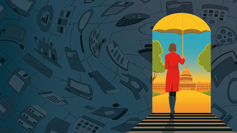
At the heart of our new brand is a simple idea: From Chaos, Clarity.
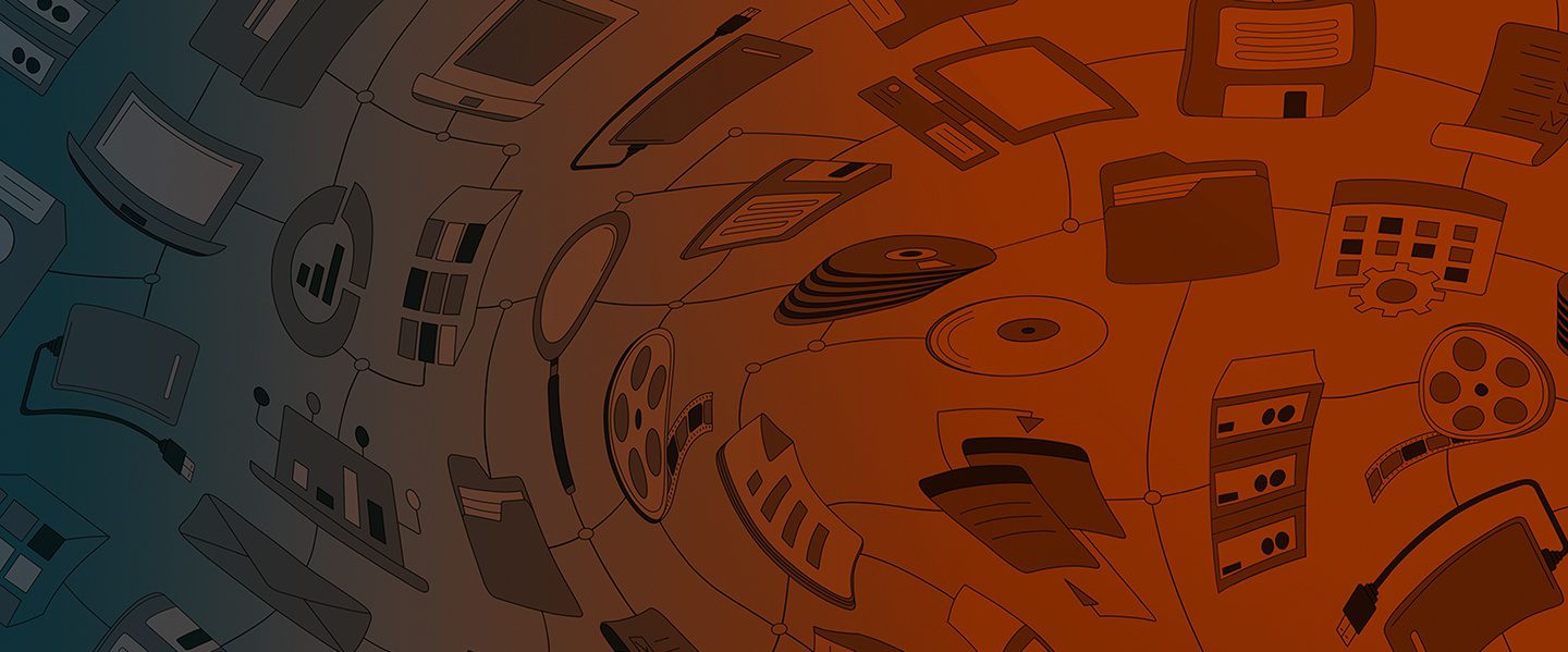
Every day, we help organizations transform complex, disconnected information into a valuable asset that supports better decisions, reduces risk, and creates new opportunities.
Our refreshed visual identity reflects that journey—from confusion to confidence, from uncertainty to understanding, and from information overload to purposeful action.
What Changed
The new brand introduces:
- A modern visual identity
- Clearer, more direct messaging
- A redesigned website
- Stronger storytelling focused on client outcomes


While our look has evolved, our commitment to helping organizations solve their most complex information challenges remains unchanged.
As Steve Erickson, President and CEO, explains:
“We’re aligning our brand with the company we already are.”
– Steve Erickson, President and CEO
Built Around the Realities Our Clients Face
The promise of “From Chaos, Clarity” resonates across the industries we serve. Whether managing complex capital projects, protecting intellectual property, supporting critical infrastructure, or improving public access to information, organizations face increasing pressure to make sense of growing volumes of information.
Our new brand reflects the role Access Sciences plays in helping clients bring order, accountability, and confidence to that complexity.
We invite you to explore our new website and learn more about how we help organizations move from chaos to clarity.